Cast to last.
Client
NORSmaterials
Deliverables
Brand strategy
Naming
Brand identity
Web Design
Social Media
Year
2025
Credits
Børge Myrnes
Matt Imling
Einar Aslaksen
NORSmaterials builds for extreme conditions. For decades, their materials have delivered resilience to heavy industry. Previously known as Strukturplast, the company had outgrown the structural plastics category it was named after and needed a new brand to support its ambitions in a global market.
We developed a new strategy, name and visual identity to establish a clearer and more distinctive position for its next stage of growth, with a system built to endure.
Logo
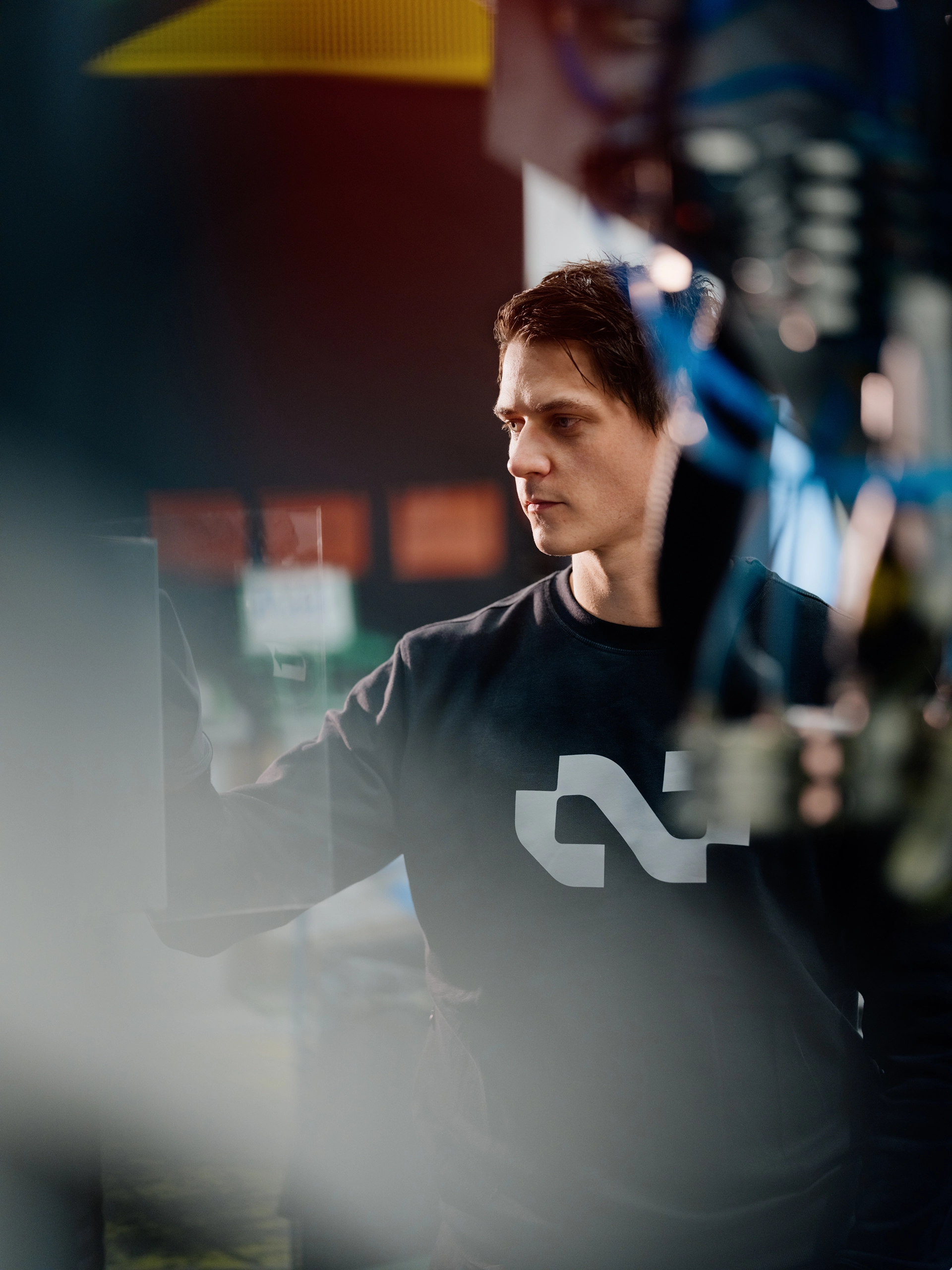
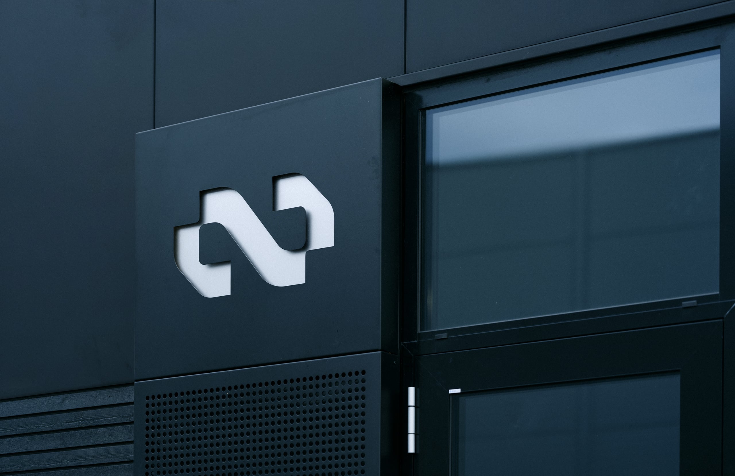
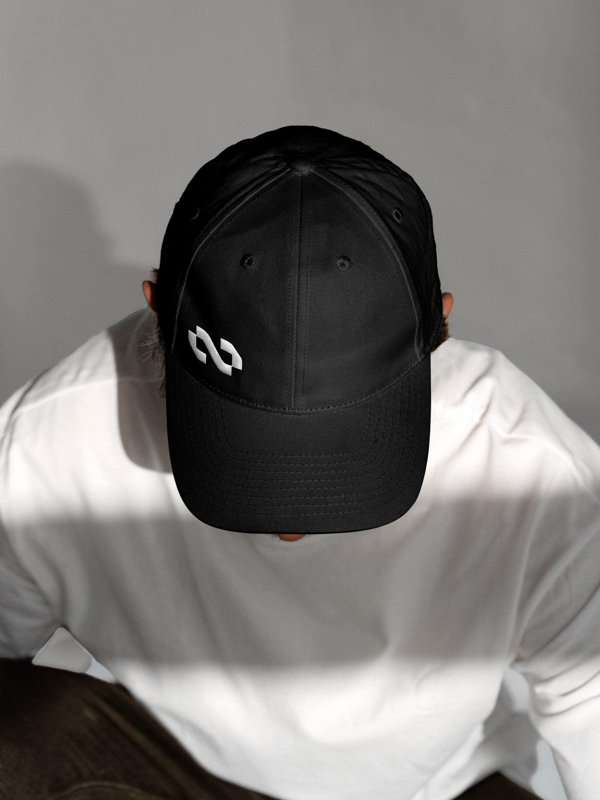
The mark draws on Norse knotwork and Midgardsormen, a serpent from Norse mythology, both associated with strength and endurance.
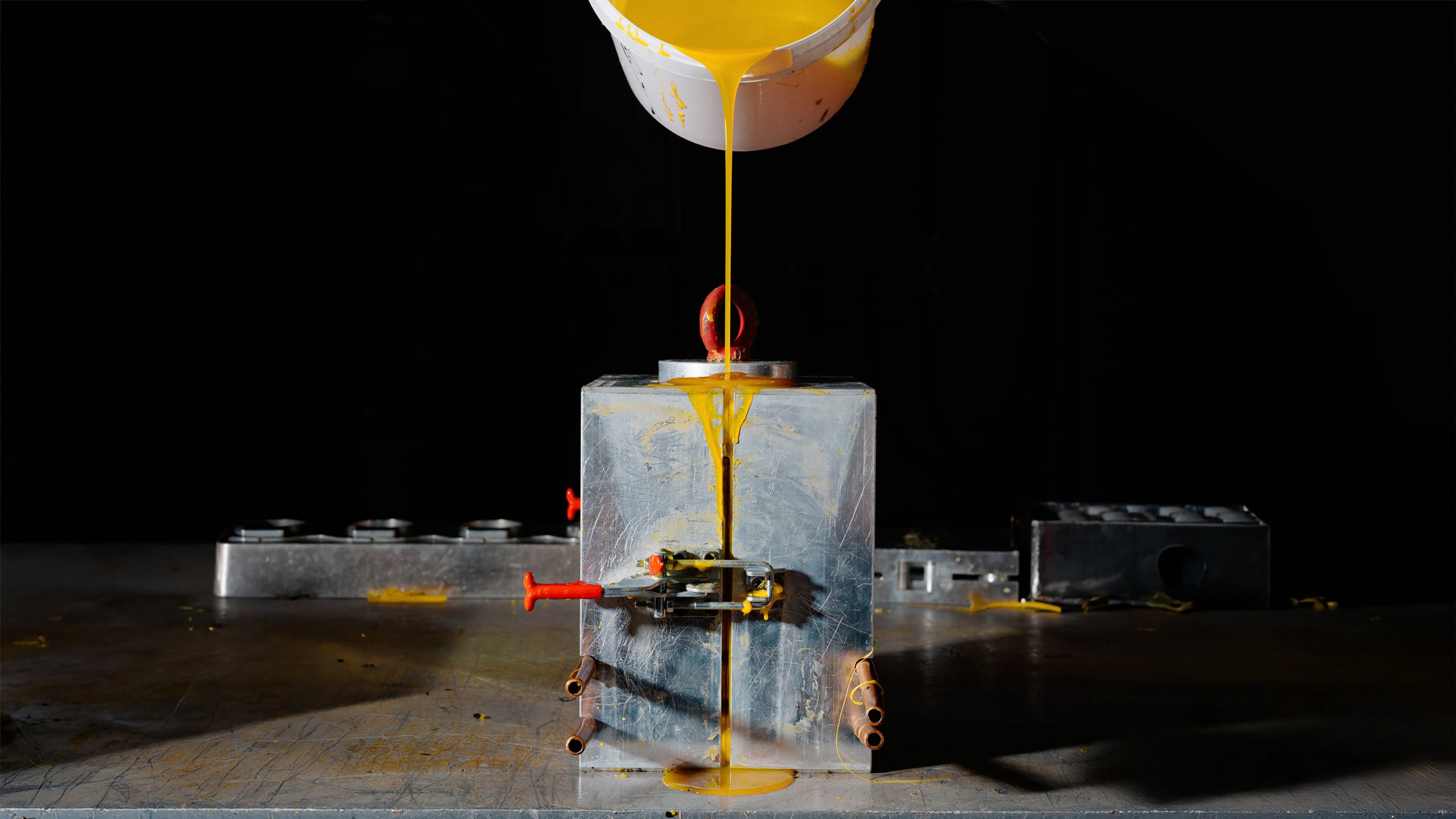
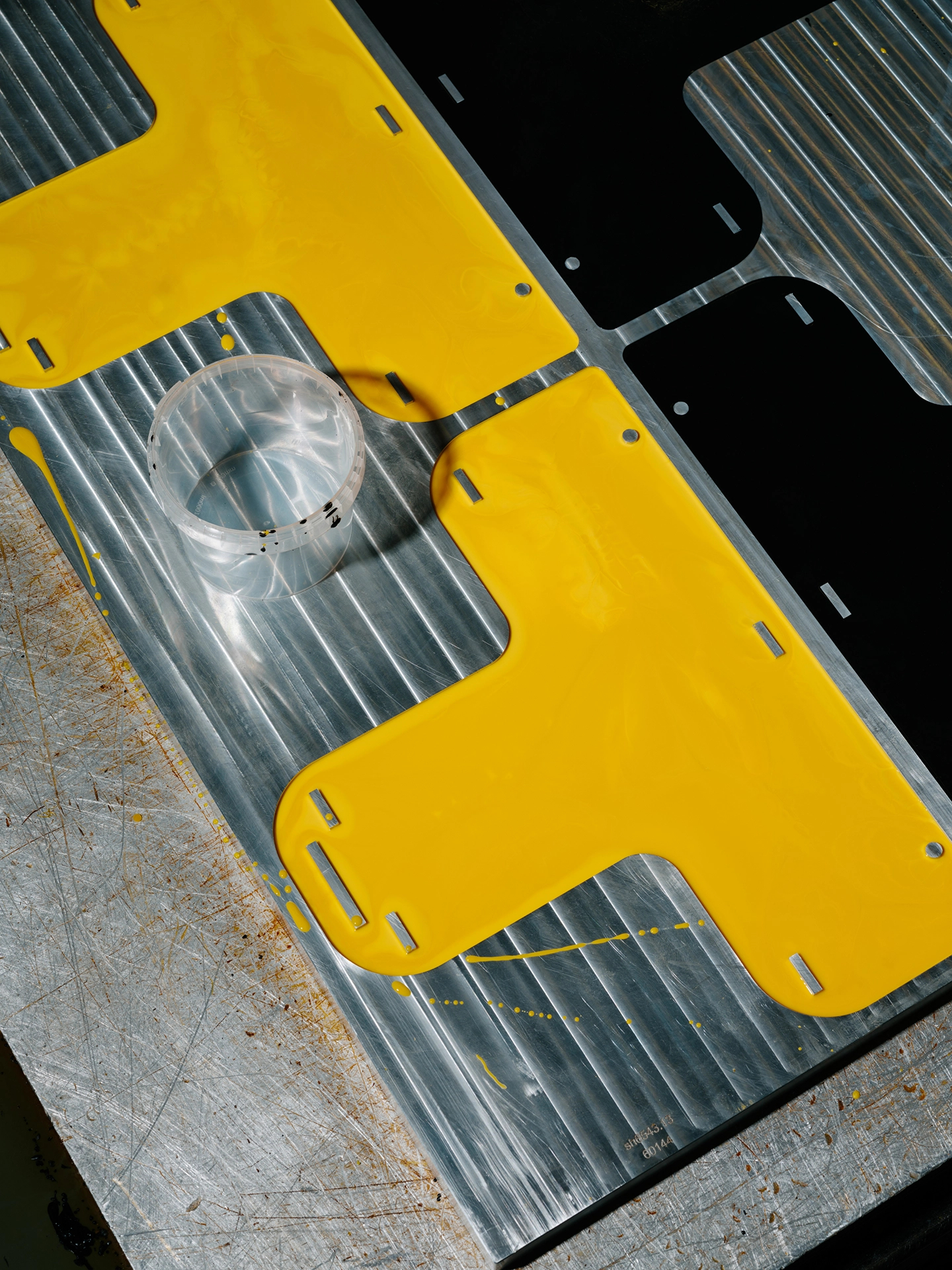
A distinctive brand typeface inspired by the casting moulds used to manufacture NORSmaterials’ products.
Typeface
The typeface takes cues from both NORSmaterials’ products and production process. Radiused where a mould softens an edge, flat where it cuts clean.
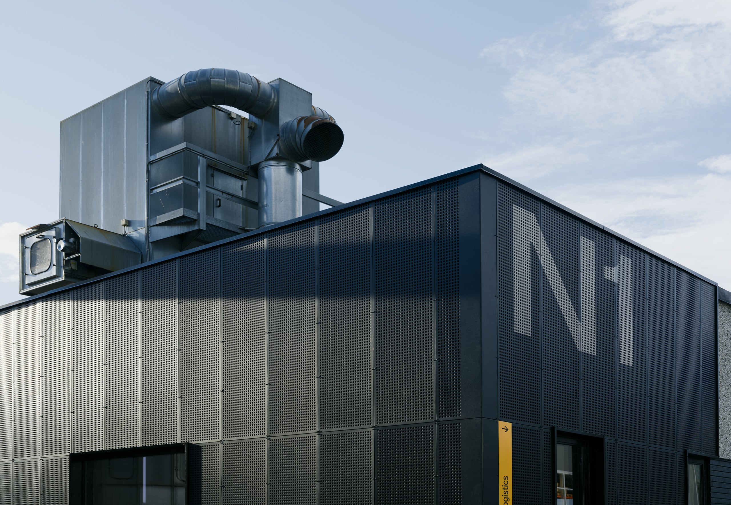
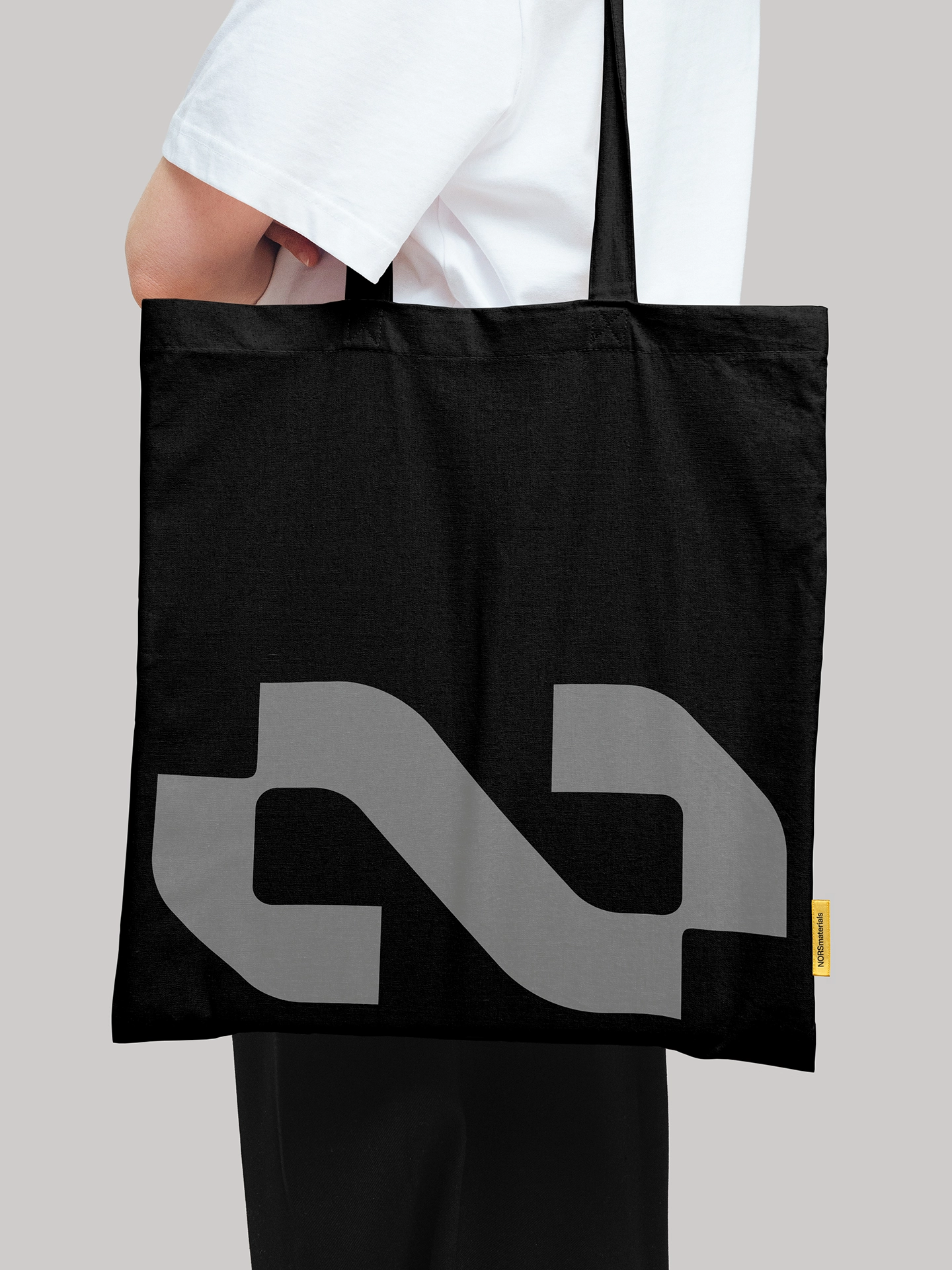
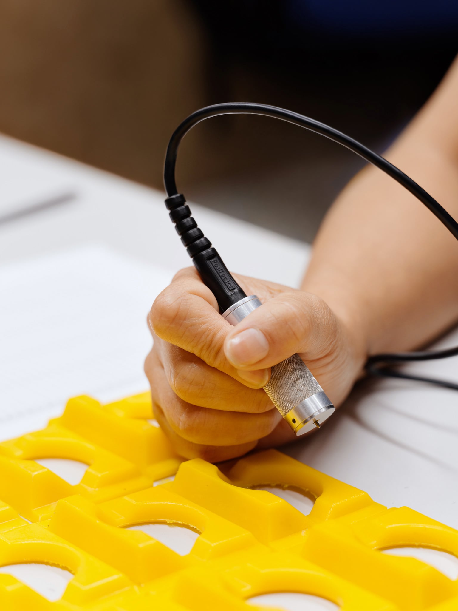
The identity moves the way the material does. It deforms under load, then returns to its shape.
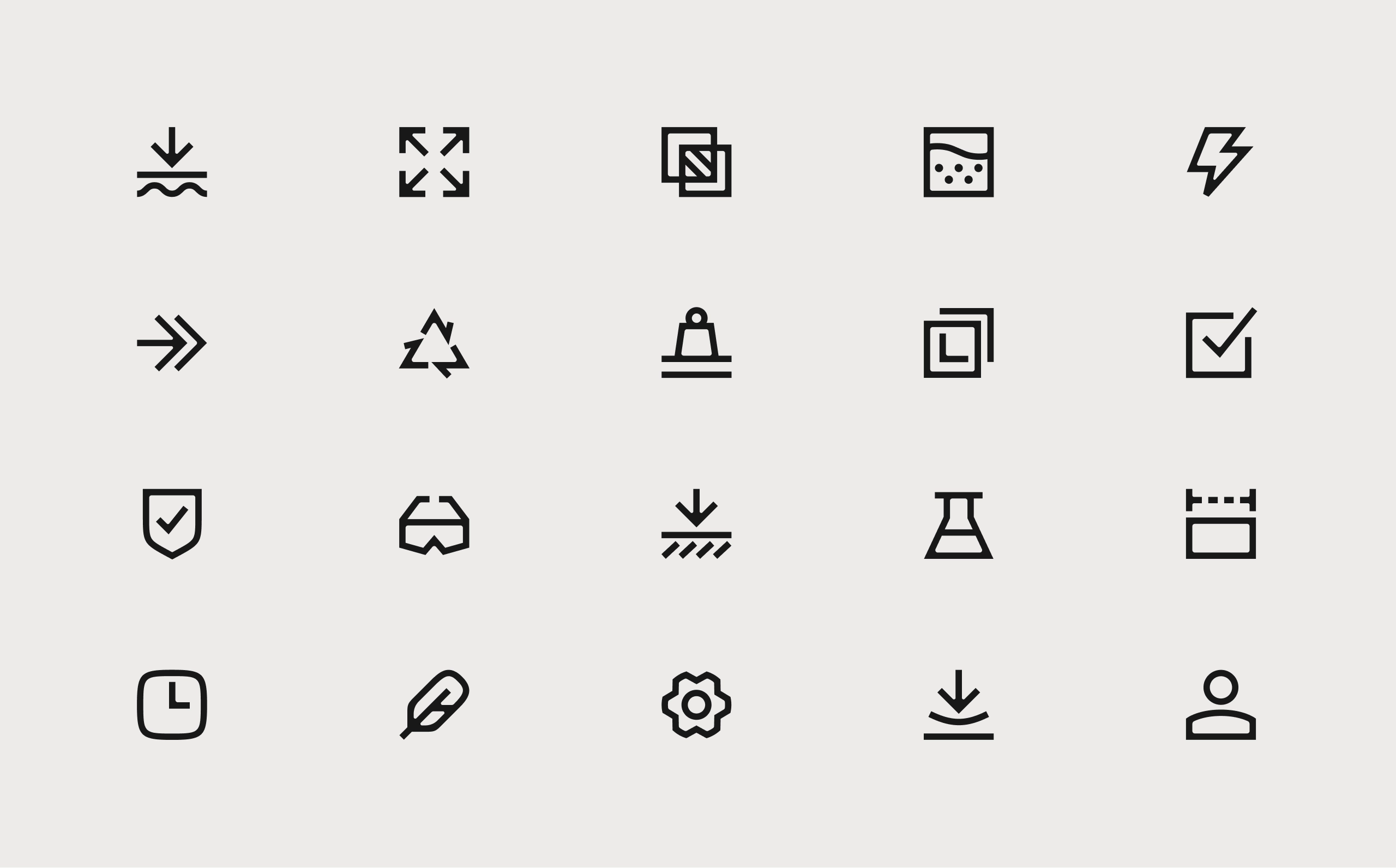
Icons
The icons are made to perform everywhere NORSmaterials is deployed. Their forms follow the same principles as the brand typeface, creating a consistent expression across the identity.
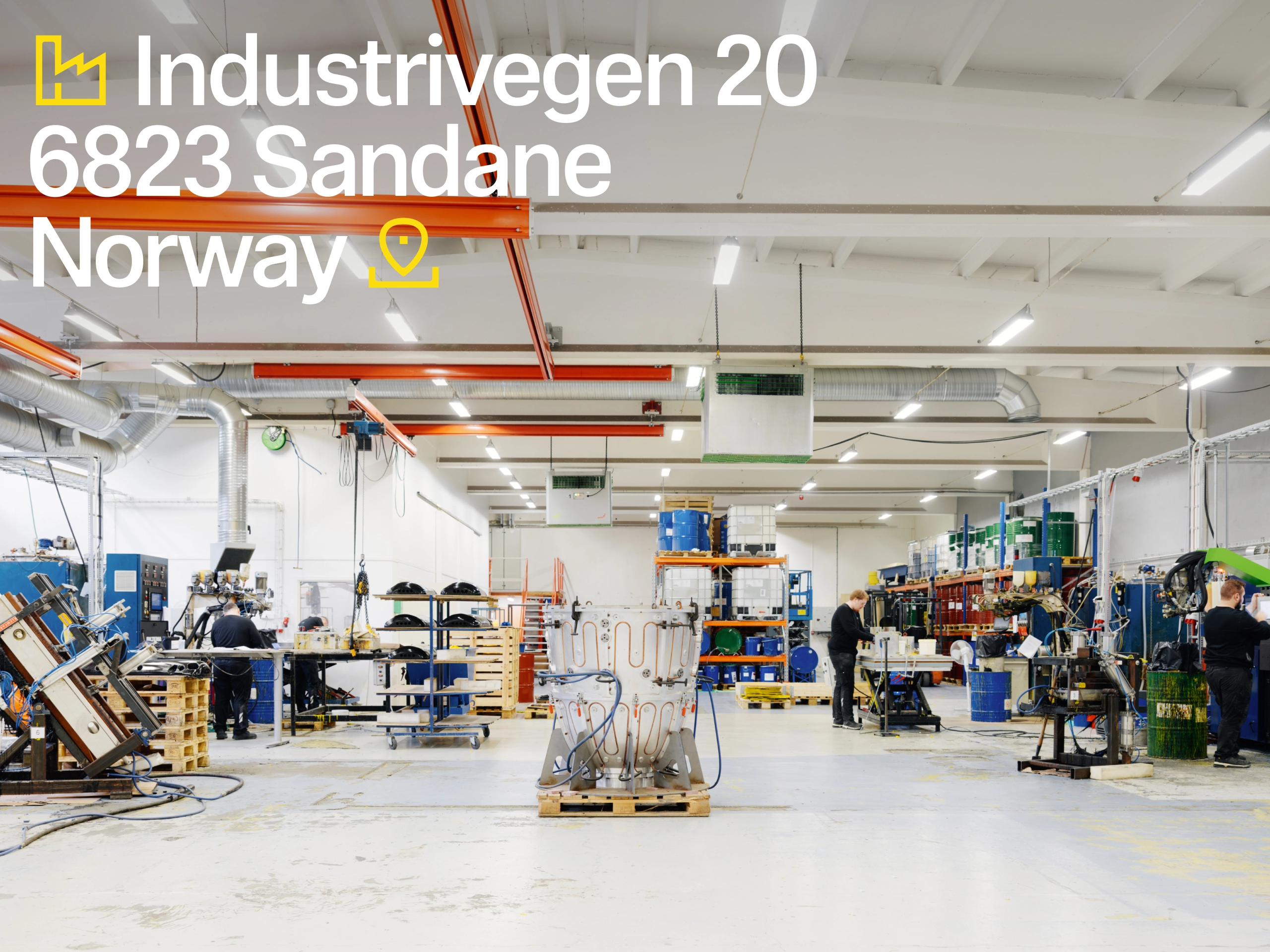
Decades of materials, engineering and services structured into one system.
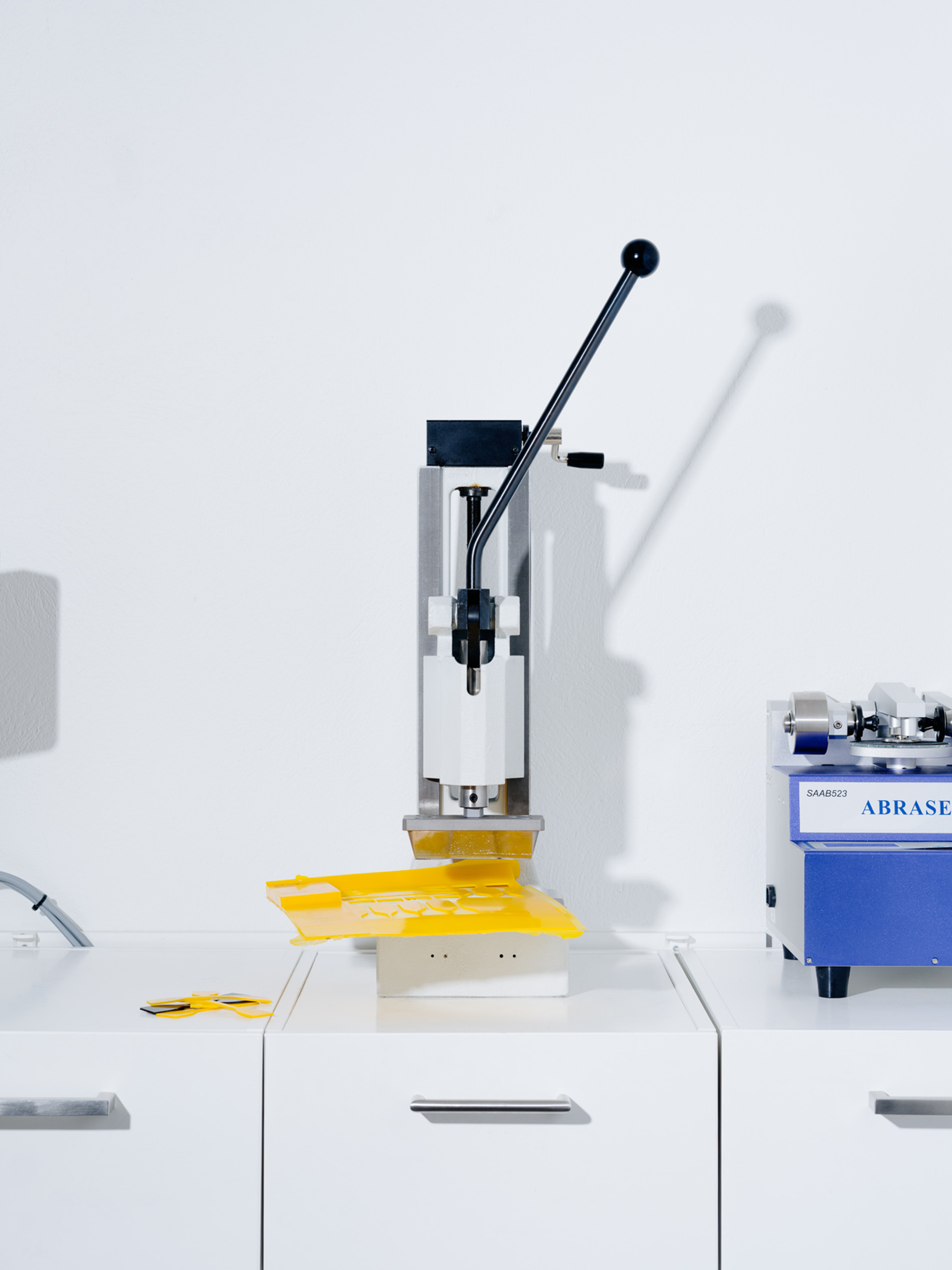
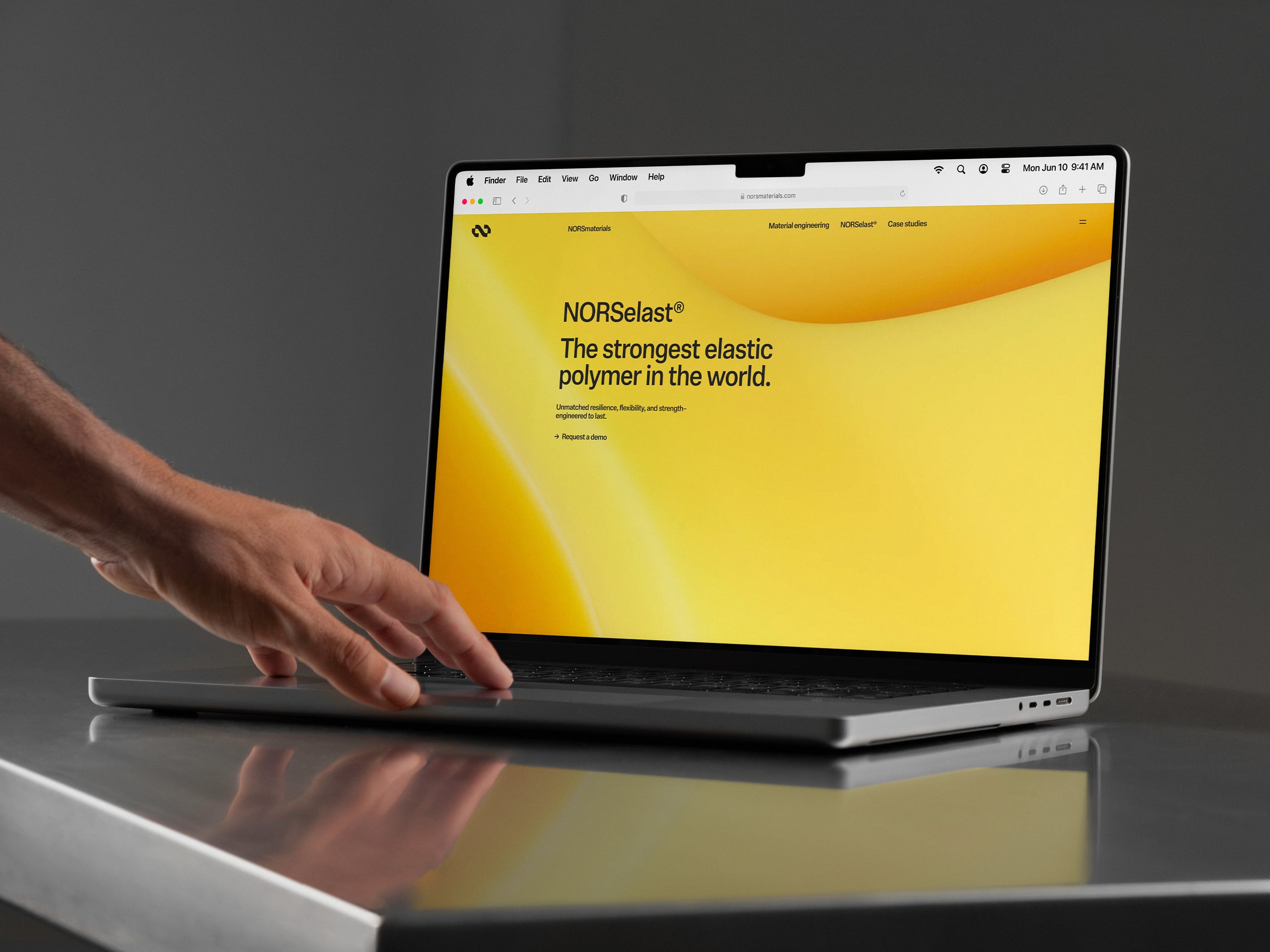
The website carries three material families, four services and five industries on one layout framework.